ARTICLE
Subscription Churn Dashboard: The 2026 Guide to Actionable Revenue Intelligence
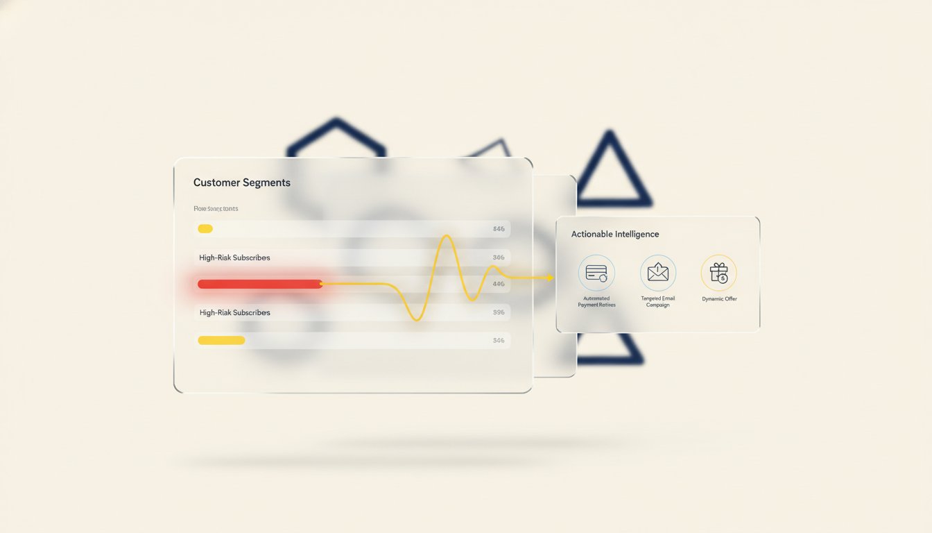
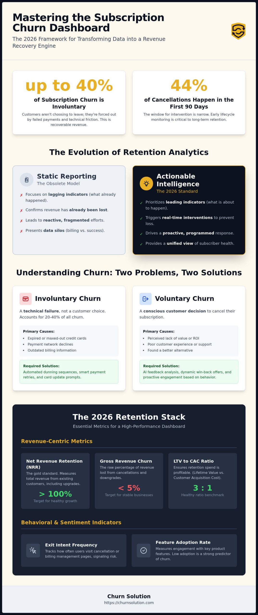
Up to 40% of subscription churn is involuntary, meaning your customers aren’t choosing to leave; they’re being forced out by failed payments and technical friction. If your current subscription churn dashboard looks more like a tombstone than a control center, you’re losing revenue that’s already been earned. With 44% of cancellations happening within the first 90 days, the window to intervene is narrow. Most leaders are tired of staring at data silos where billing information and customer success metrics never meet, leaving them with clear problems but no visible solutions.
It’s time to stop reacting to losses and start engineering retention. You don’t need more passive data; you need actionable revenue intelligence that transforms your reporting into a proactive recovery engine. This guide will show you how to master the interventions that define a modern dashboard, ensuring every insight triggers a direct response. We’ll explore the essential 2026 framework for real-time risk alerts, AI-driven feedback analysis, and the direct links to win-back campaigns that turn high-risk segments into long-term revenue assets.
Key Takeaways
- Transform your subscription churn dashboard from a passive reporting tool into a dynamic command center that prioritizes actionable revenue intelligence over static vanity metrics.
- Master the 2026 retention stack by identifying high-impact leading indicators that signal churn risk before revenue loss occurs.
- Build a high-performance architecture that integrates billing platforms with automated dunning and smart retry workflows for immediate involuntary churn recovery.
- Utilize AI feedback analysis to decode customer sentiment and deploy dynamic offers that effectively save subscribers at the point of exit.
What is a Subscription Churn Dashboard in 2026?
A modern subscription churn dashboard serves as the centralized command center for monitoring subscriber health; it is the primary engine for revenue protection. In the current market, static reporting that merely tells you what happened last month is a liability. High-performance teams have transitioned to dynamic intelligence, which focuses on what to do right now. This shift transforms the dashboard from a passive display into an active participant in your retention strategy. It bridges the gap between raw data and immediate intervention, ensuring that no customer segment drifts toward cancellation without a programmed response.
A churn dashboard is a real-time diagnostic tool for subscription health. It functions as the brain of a broader revenue protection ecosystem, directing the “muscles” of your operation, such as automated cancellation flows and dunning sequences. By synthesizing billing events, behavioral triggers, and customer sentiment, it provides a unified view of your business’s stability. Without this centralized intelligence, your retention efforts remain fragmented, reactive, and ultimately ineffective.
The Evolution of Retention Analytics
Basic spreadsheets and monthly churn reports are obsolete. They provide lagging indicators that only confirm revenue has already been lost. In 2026, the focus has shifted to real-time intervention triggers based on leading indicators. Modern stacks no longer treat data in isolation; they integrate billing platforms, user behavior, and direct feedback into a single stream. This allows companies to identify the 44% of subscribers who typically cancel within the first 90 days before they even reach the exit page. You’re no longer just tracking a number; you’re managing a lifecycle.
Voluntary vs. Involuntary Churn Data
Your dashboard must distinguish between voluntary and involuntary churn because they require entirely different recovery mechanisms. Voluntary churn occurs when a customer makes a conscious decision to leave. This requires behavioral analysis and dynamic offers to resolve. Conversely, involuntary churn is a technical failure, often caused by expired cards or network declines. Research indicates that involuntary churn accounts for 20% to 40% of all subscription losses. Treating these as a single metric is a strategic error. A sophisticated dashboard isolates these variables, allowing you to deploy smart retries for technical failures while using feedback analysis to address the root causes of customer dissatisfaction.
The 2026 Retention Stack: Essential Metrics for Your Dashboard
Strategic decision-making requires a hierarchy of data. A high-performance subscription churn dashboard must prioritize leading indicators that predict future revenue loss, rather than just tallying historical departures. While legacy reporting focuses on what happened, modern intelligence focuses on what is about to happen. You must weigh these metrics based on your business maturity; early-stage startups should focus heavily on feature adoption, while mature enterprises prioritize Net Revenue Retention (NRR) and expansion efficiency. For a complete breakdown of these calculations, consult our specialized Churn Metrics framework.
Effective retention isn’t a guessing game. It’s a calculated response to specific data signals. By categorizing your metrics into revenue and behavioral buckets, you create a multidimensional view of customer health. This allows you to identify which customers are truly loyal and which are simply waiting for their billing cycle to end. If you aren’t tracking these indicators in real time, you’re essentially flying blind through the most critical phases of the customer lifecycle.
Revenue-Centric Metrics: NRR and Gross Churn
Net Revenue Retention (NRR) remains the gold standard for SaaS health because it accounts for the total revenue retained from your existing customer base, including upgrades. Gross churn measures the raw loss of revenue, but NRR reveals the true sustainability of your growth. If your gross churn is high but your NRR stays above 100%, your expansion strategy is masking a retention problem. Additionally, monitoring the LTV/CAC ratio ensures your retention spend isn’t cannibalizing your profit margins. A healthy ratio typically sits at 3:1 or higher, providing the necessary buffer to invest in aggressive recovery campaigns.
Behavioral and Sentiment Indicators
Data without context is noise. To prevent the 44% of cancellations that occur within the first 90 days, your subscription churn dashboard must track exit intent frequency. This includes monitoring how often users visit the billing settings or downgrade their plans. Feature adoption scores identify “quiet churners”—users who pay but don’t engage. These are your highest-risk segments. By integrating AI sentiment analysis from Exit Surveys, you can categorize qualitative feedback into actionable categories like price sensitivity or missing features. This turns “unhappy” into a specific technical or commercial fix.
Stop guessing why customers leave and start commanding your data. You can access our retention toolkit to begin building a more resilient revenue stream today.
Static Reporting vs. Actionable Intelligence: The Vital Difference
Visualizing data is not the same as managing revenue. Many leaders mistake a polished subscription churn dashboard for a strategy; however, a chart that merely documents decline is a tombstone. The vital difference between static reporting and actionable intelligence lies in the transition from observation to execution. If your dashboard requires a human to interpret a trend, export a CSV, and manually email a list of users, your retention system is already too slow. Modern intelligence uses automated segmentation to categorize users by risk profile and lifetime value, turning raw metrics into a sequence of programmed interventions.
A high-performance subscription churn dashboard must act as a trigger mechanism. It shouldn’t just show you that revenue is leaking; it must plug the hole. By contrasting legacy systems with modern retention engines, the gap in efficiency becomes clear.
| Feature | Legacy Dashboard | Modern Retention Engine |
|---|---|---|
| Data Refresh | Monthly or Weekly | Real-Time |
| Granularity | Aggregate Totals | Segment-Specific |
| Functionality | Passive Reporting | Automated Intervention |
| Outcome | Identifying Problems | Executing Solutions |
The “So What?” Factor in Data Visualization
Audit your current dashboard by asking one question: what is the immediate next step for every metric shown? If you see that “Churn is up 2%” but don’t know which specific cohort is driving that change, the data is useless. Move away from vanity metrics that offer a false sense of awareness. Real-time alerts must prioritize high-value account loss, allowing your team to focus on the 20% of customers who represent 80% of your revenue. This granular approach ensures that your response is proportional to the risk.
Bridging the Gap Between Data and Intervention
Timing is the most critical variable in retention. Connecting your dashboard segments directly to Dynamic Offers allows you to present the right incentive at the exact moment a user considers leaving. When your data-driven triggers are automated, you eliminate the lag between insight and action. This reduces the manual workload for your RevOps team and ensures that every at-risk subscriber is met with a personalized recovery flow. By the time a human notices a trend in a legacy report, it’s usually too late to save the account.
Architecture of Recovery: Building a Dashboard That Triggers Results
A sophisticated subscription churn dashboard is not a post-mortem reporting tool; it’s the blueprint for a high-performance recovery system. To move beyond passive observation, your architecture must bridge the gap between your billing engine, like Stripe or Braintree, and your active retention layers. This integration ensures that every data point, from a failed payment attempt to a specific plan downgrade, triggers an immediate, programmed response. Without this technical cohesion, your data remains trapped in silos, rendering even the most accurate metrics useless for real-time intervention.
Building this architecture requires a focus on data hygiene and granularity. A “one-size-fits-all” approach to retention fails because it ignores the unique motivations of different customer cohorts. By integrating Smart Retries directly into your dashboard’s recovery logic, you address the 20% to 40% of churn that is purely technical. This allows your team to focus their strategic efforts on voluntary churn while the system automatically repairs the revenue leaks caused by expired cards and network declines.
Segmenting Your Churn Data for Precision
Precision is the foundation of effective recovery. You must segment your churn data by plan tier, tenure, and acquisition channel to identify the root causes of subscriber loss. For instance, customers acquired through aggressive discounting often exhibit different churn patterns than those acquired through organic search. Utilizing Customer Segmentation allows you to personalize your recovery flows, ensuring that a high-value enterprise account receives a different intervention than a low-tier monthly subscriber. This level of detail prevents you from deploying expensive save offers to segments that don’t justify the investment.
Automation Triggers: Turning Data into Dunning
Involuntary churn recovery requires a seamless transition from dashboard insight to dunning execution. When your subscription churn dashboard identifies a payment failure, it should immediately initiate Payment Recovery sequences tailored to the specific failure code. This isn’t just about sending emails; it’s about creating a feedback loop where the results of your retry logic and dunning campaigns inform future strategy. If a particular retry schedule consistently fails for a specific card type, your dashboard should highlight that pattern, allowing you to optimize your technical recovery settings for maximum efficiency.
Commanding Your Retention Strategy with Churn Solution
A subscription churn dashboard provides the visibility required for survival, but Churn Solution provides the execution layer required for growth. Visibility without a mechanism for response is merely a record of failure. By positioning our platform as the operational core of your retention stack, you transform passive charts into a proactive recovery engine. Our system doesn’t just aggregate data; it weaponizes it. Through AI Feedback Analysis, we convert the noise of raw exit surveys into a clear, strategic roadmap. This ensures your team isn’t guessing at why customers leave; they’re executing precise interventions based on verified sentiment patterns.
Deploying win-back campaigns becomes a matter of logic rather than guesswork. When your dashboard identifies a segment of high-value churners who left due to specific feature gaps or price sensitivity, you can immediately trigger automated responses. This level of synchronization between data and action is what separates market leaders from those struggling with a 5.3% average monthly churn rate. Protecting your revenue in 2026 demands a shift from manual oversight to automated intelligence.
From Insight to Reactivation
Your dashboard data should never sit idle. It must fuel targeted Reactivation campaigns that bring lost subscribers back into the ecosystem. By leveraging historical behavior and exit reasons, you can offer personalized incentives that address the root cause of their initial departure. You must also refine these strategies through AB Experiments. Testing different save offers and cancellation flows allows you to optimize your retention ROI in real time. Every cancellation attempt is a data-driven learning opportunity that strengthens your defense against future revenue loss.
The Future of Revenue Protection
Automated retention is no longer a luxury for SaaS companies; it’s a fundamental requirement for sustainable growth. The long-term impact of a data-driven retention culture extends far beyond immediate saves. It compounds your Lifetime Value (LTV) and reduces the pressure on your acquisition channels. In a competitive subscription economy where customer acquisition costs remain high, protecting the revenue you’ve already earned is the most efficient path to profitability. Your next steps are clear. Audit your current subscription churn dashboard for actionable utility. Identify the gaps in your recovery architecture. Plug the leaks before they become a flood.
Master Your Revenue Recovery Engine
Mastering the subscription economy requires more than just awareness; it requires an infrastructure of intervention. You now have the framework to transform your subscription churn dashboard from a passive monitor into a high-velocity recovery engine. By bridging the gap between raw billing data and automated retention workflows, you ensure that every at-risk account is met with a calculated response. Static reporting is a relic of the past. Actionable intelligence is the only path forward for high-growth SaaS organizations.
Churn Solution provides the exact tools needed to execute this strategy. Our platform delivers AI-powered feedback analysis for precise sentiment tracking and automated cancellation flows that consistently achieve save rates exceeding 20%. With comprehensive dunning and smart retry logic, we secure your revenue against technical failures before they impact your bottom line. It’s time to stop watching your revenue leak and start reclaiming it through precision automation.
The path to sustainable growth is built on retention. Start optimizing your recovery architecture today and secure the revenue your business has already earned. Your data is ready to work for you; ensure you have the right engine to drive it.
Frequently Asked Questions
What is the most important metric on a churn dashboard?
Net Revenue Retention (NRR) is the most critical metric for any subscription business in 2026. While standard churn rates provide a baseline, NRR accounts for downgrades and expansion revenue, offering a comprehensive view of your ability to grow within your existing customer base. It’s the gold standard for measuring long-term business health and sustainability because it proves whether your product provides enough value to drive account expansion.
How do I differentiate between voluntary and involuntary churn on my dashboard?
Distinguish these by the specific trigger event. Involuntary churn stems from technical payment failures like expired cards or network declines, whereas voluntary churn occurs when a user actively initiates a cancellation. Your subscription churn dashboard must pull data from both your billing engine and your cancellation flows. This separation is vital because technical failures require smart retries, while conscious exits require behavioral interventions and dynamic offers.
Can I build a churn dashboard in Stripe?
Stripe offers foundational analytics, but it lacks the qualitative depth required for advanced revenue protection. A dedicated subscription churn dashboard integrates AI feedback analysis and exit survey data to uncover the “why” behind the “what.” You need more than just a notification of a failed payment; you need a strategic roadmap based on customer sentiment and exit intent to stop customers from leaving in the first place.
How often should I review my subscription churn dashboard?
Monitor your dashboard daily for anomalies and perform a rigorous deep-dive review every week. High-growth SaaS organizations can’t afford to wait for monthly reports to identify revenue leaks. Configure automated alerts to notify your team of sudden spikes within specific segments. This proactive approach allows for immediate intervention before a minor trend becomes a significant loss of annual recurring revenue.
What should I do if my dashboard shows a spike in churn?
Begin by segmenting the data to isolate the specific plan, region, or acquisition cohort affected by the spike. Once you’ve identified the “who,” use AI Feedback Analysis to determine the root cause. This process reveals whether the issue is a technical bug, a recent pricing adjustment, or a competitive threat. Data without segmentation leads to broad, ineffective responses that fail to address the actual problem.
Does a churn dashboard help with win-back campaigns?
Yes, a dashboard is the primary driver of effective reactivation. By identifying the exact reasons for departure, you can build Win-back campaigns that offer specific solutions to previous pain points. This targeted approach significantly increases reactivation rates compared to generic outreach. It turns your exit data into a high-performance acquisition channel for returning subscribers who already know your brand’s value.
- Key Takeaways
- Table of Contents
- What is a Subscription Churn Dashboard in 2026?
- The 2026 Retention Stack: Essential Metrics for Your Dashboard
- Static Reporting vs. Actionable Intelligence: The Vital Difference
- Architecture of Recovery: Building a Dashboard That Triggers Results
- Commanding Your Retention Strategy with Churn Solution
- Master Your Revenue Recovery Engine
- Frequently Asked Questions

Churn solution that turns your customers right around.
Related Articles
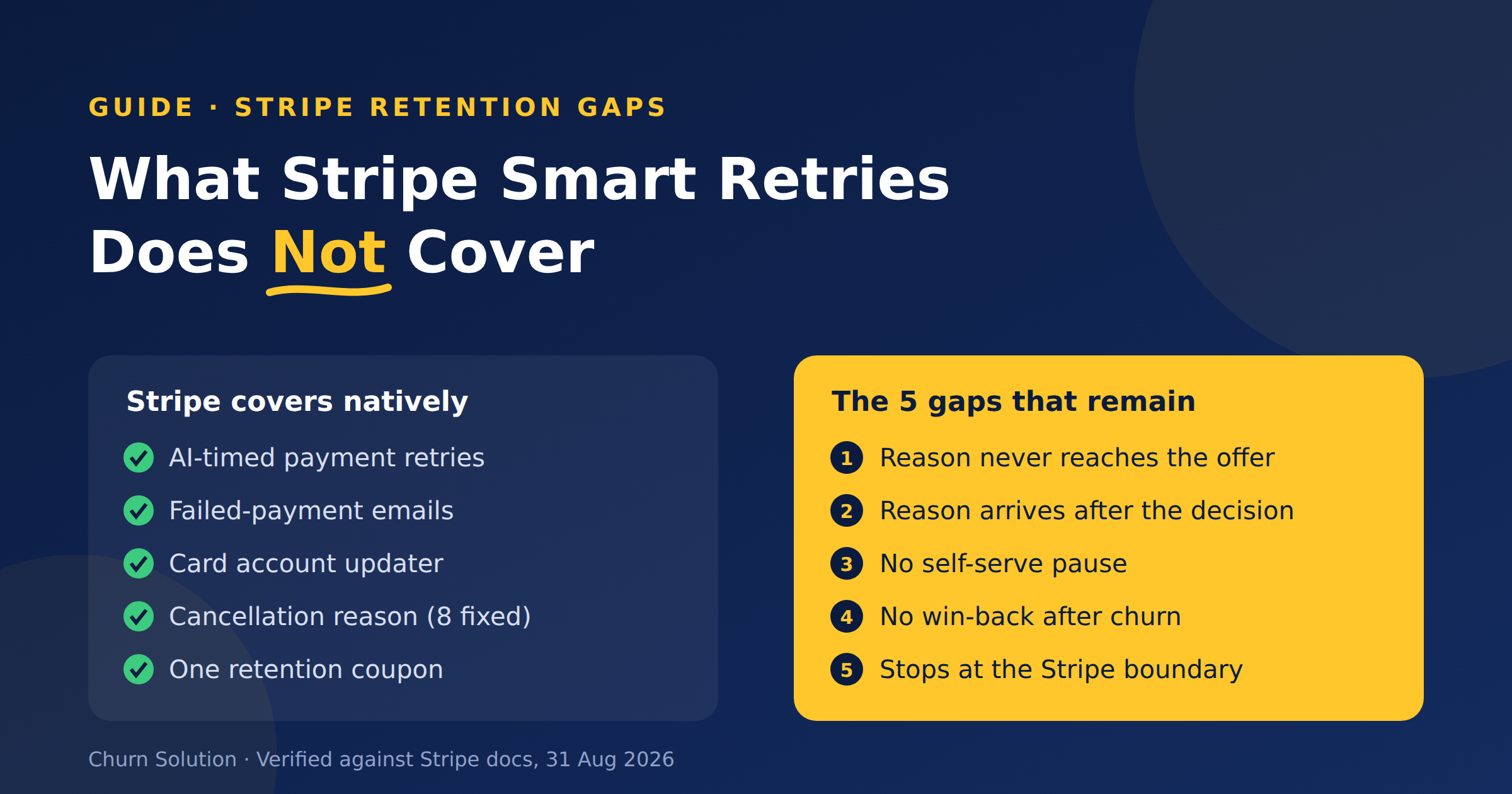
What Stripe Smart Retries Does Not Cover
Stripe Smart Retries recovers failed payments but doesn't run retention. Here are the five gaps that remain, sourced from Stripe's...

Membership Community Churn: The Members Who Quit Without Clicking Cancel
Quiet churn is the real leak: members who never clicked “cancel” at all. A card expires. A bank declines a...

Dynamic Retention Offers: The 2026 Guide to Automated Revenue Recovery
Did you know that acquiring a new customer in 2026 costs up to 25 times more than retaining an existing...